Why it was time for change
Chiropraktik Seeland was facing an important stage in its development: the appearance of the practice and its digital presence needed to reflect its high standards of professionalism and humanity.
The existing communication channels had grown over many years and were no longer up to date. At the same time, customers expressed a desire for guidance and easy access to information and services.
The modernization should therefore be more than just a technical update. It should reflect the practice's approach to life. The goal was clear: a digital presence that builds trust, makes processes more efficient, and increases visibility.

Clarity begins with understanding
It all started with listening. Together with the team at Chiropraktik Seeland, we immersed ourselves deeply in everyday practice: Which patient groups seek help here? What motivates them, and how do they want to be addressed? Equally important was taking a look at the wide range of services offered, from classic chiropractic care and preventive health counseling to modern treatment methods.
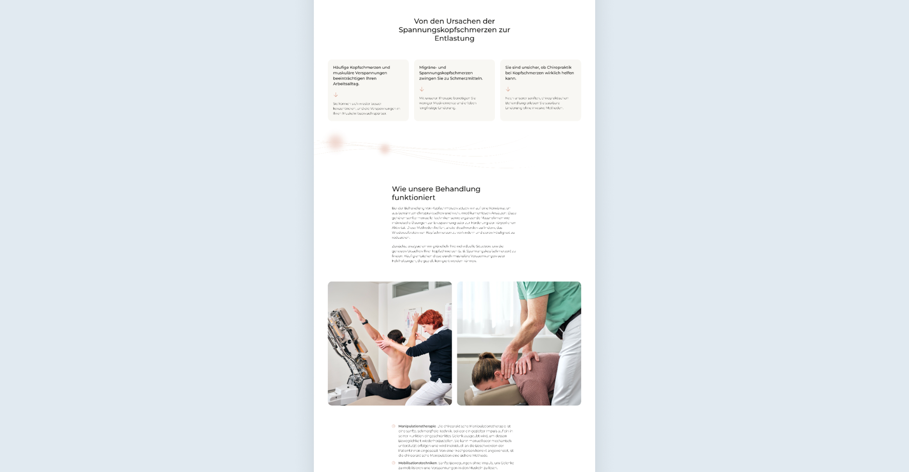
It quickly became apparent that the challenge was not only one of design, but also of content. Content in the field of chiropractic can quickly appear technical and complex. This made it all the more important to find a language that conveys medical content in an understandable and accessible way, so that target groups feel engaged.
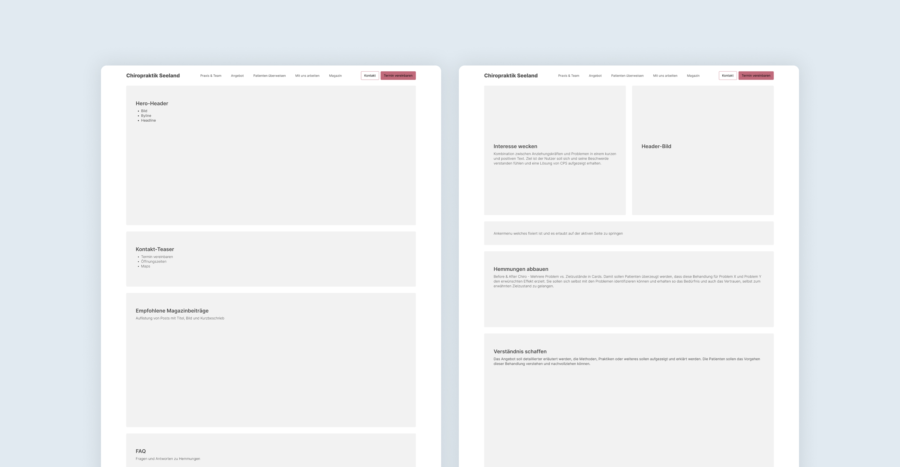
Structure as a compass
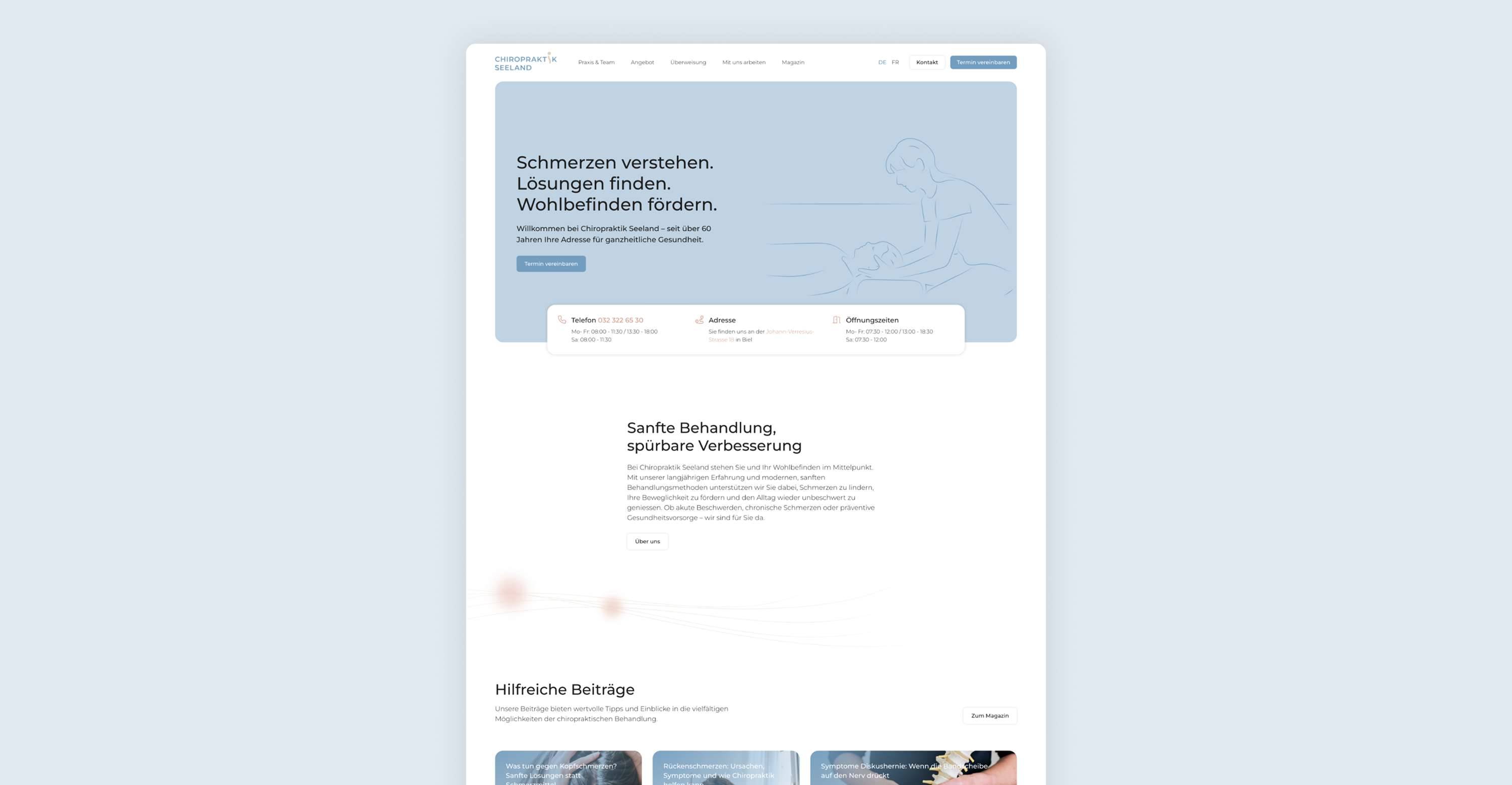
After a thorough keyword and target group analysis, the foundation for the new website was laid. A clear page architecture was developed, structured according to customer needs and SEO/AEO-relevant priorities. The conceptual approaches were then translated into a prototype to make the structure, navigation, and user guidance tangible. In several rounds of consultation, the concept was refined and the tone defined that best conveys the character of the practice.
The goal was always to strike the right balance: informative, but not overloaded. Personal, but professional. This created a foundation that provides orientation and authentically reflects the identity of the practice.
Content and design form a unified whole
After the structural development, the content and appearance were combined into a single entity. Based on the new page architecture, texts were developed that convey the wide range of services offered by Chiropraktik Seeland in a way that is understandable, credible, and patient-oriented. In close consultation with the practice team, this content was revised and optimized for AI tools and search engines.
The visual concept for the website was designed based on the new corporate design. Individual sample pages showed early on how text, color scheme, and user guidance interact. In addition, delicate line art graphics were developed to round off the appearance with a personal, distinctive touch. The result is a digital overall picture that harmonizes information, trust, and aesthetics.
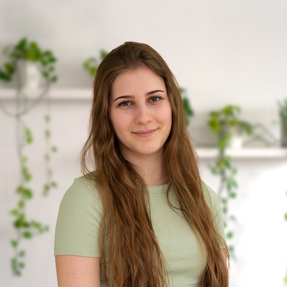
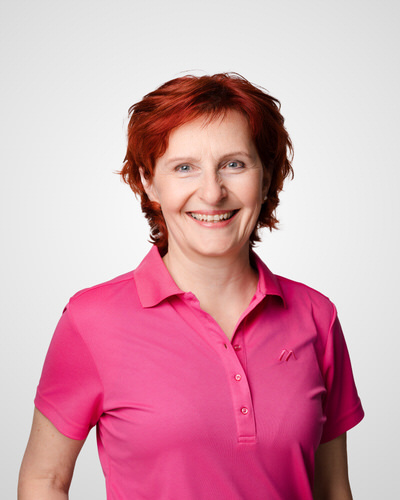
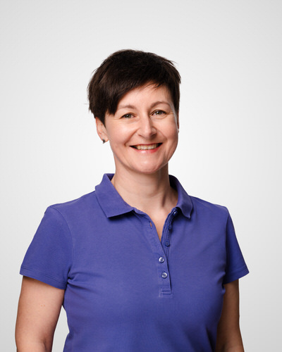
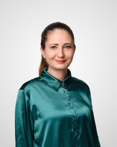
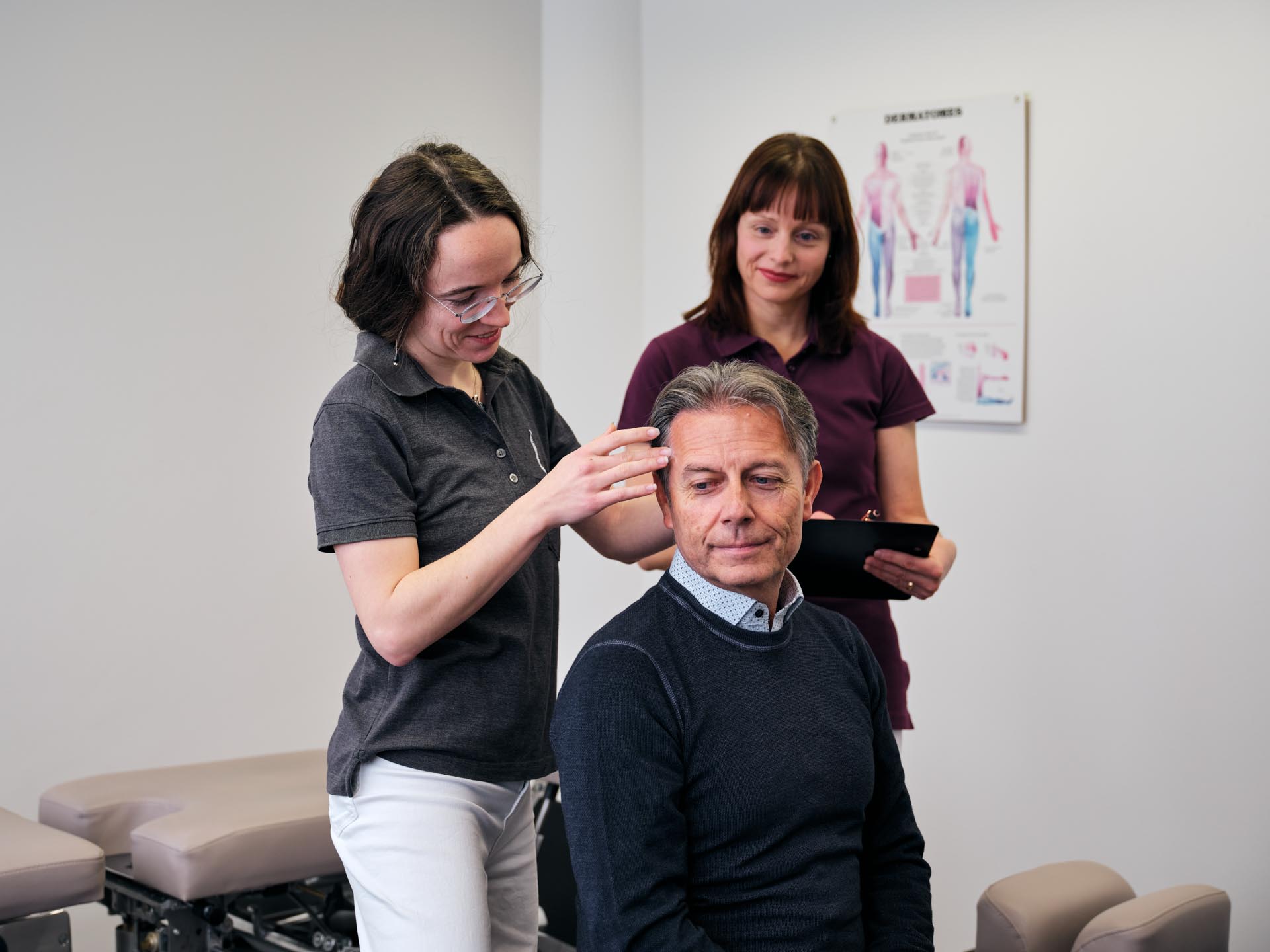
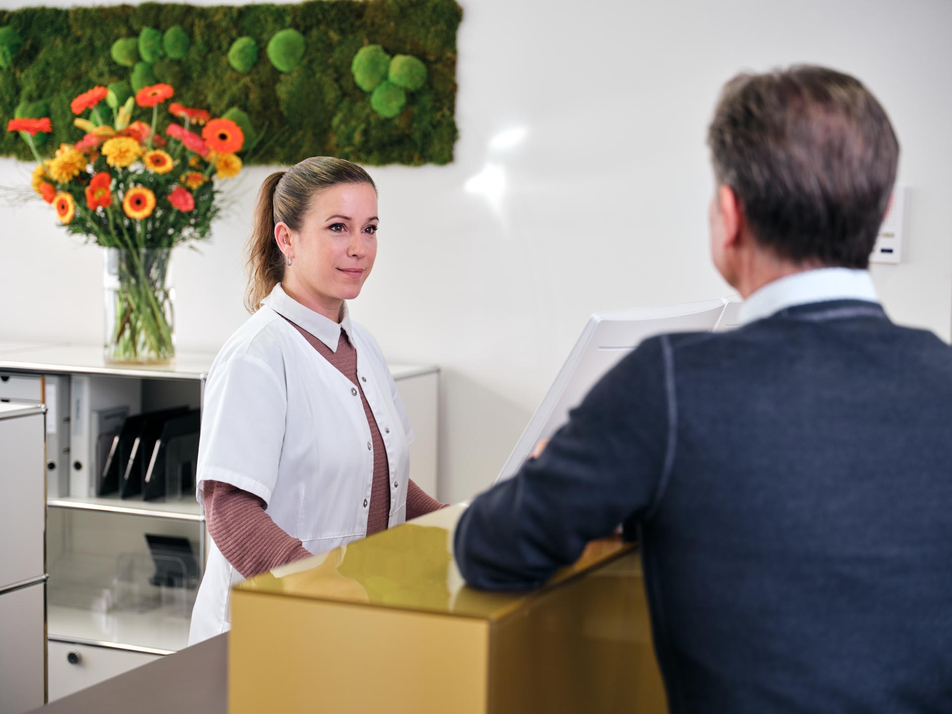
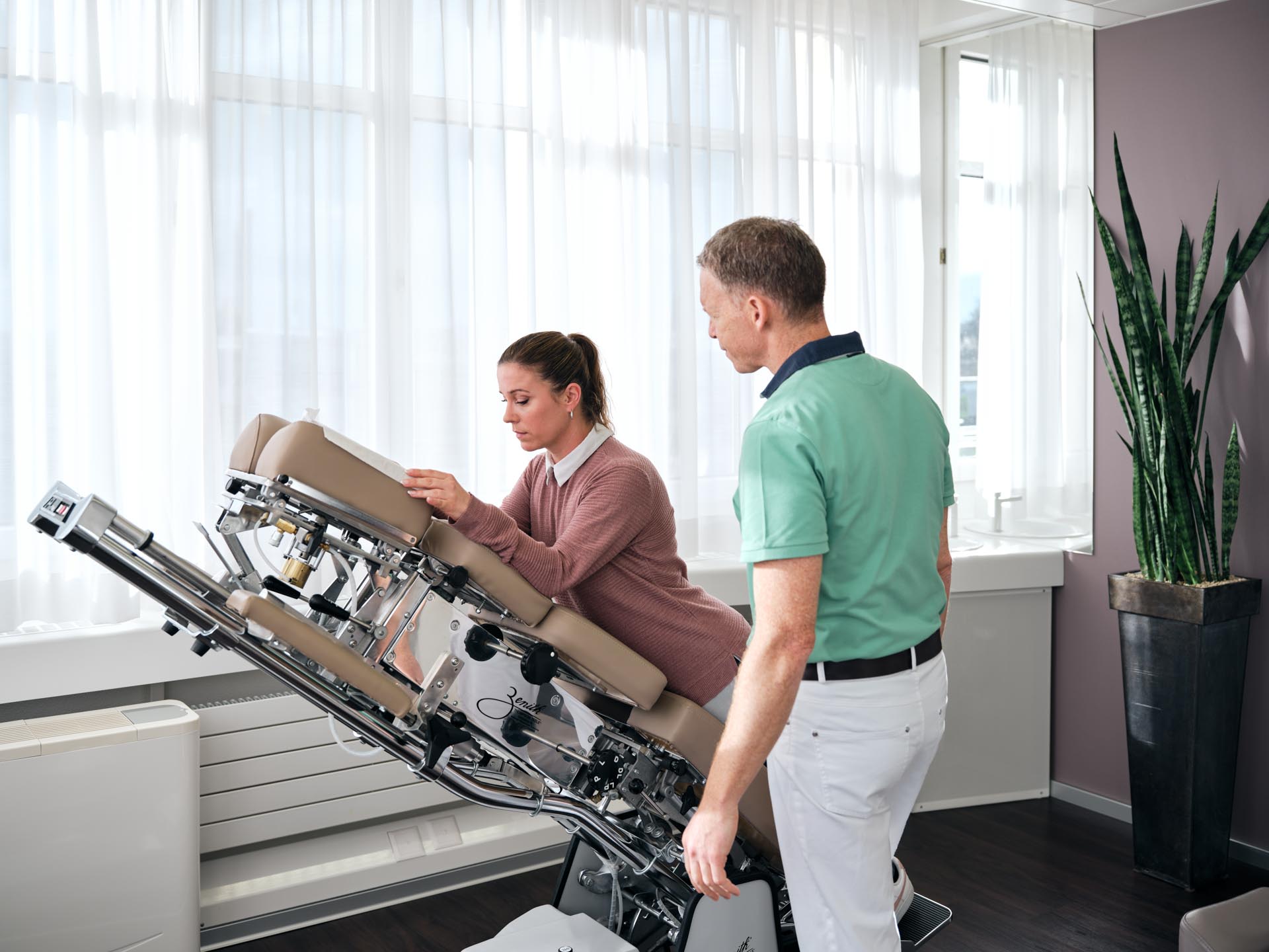
Authentic insights build trust
During this phase of the project, Chiropraktik Seeland worked with a photographer to create new, authentic images that capture the atmosphere of the practice. Scenes from everyday life at the practice, genuine moments, and real people were used to convey warmth, professional competence, and trust. These visual impressions gave the new website a clear identity and a personal touch.
Technically strong, implemented in a future-proof manner
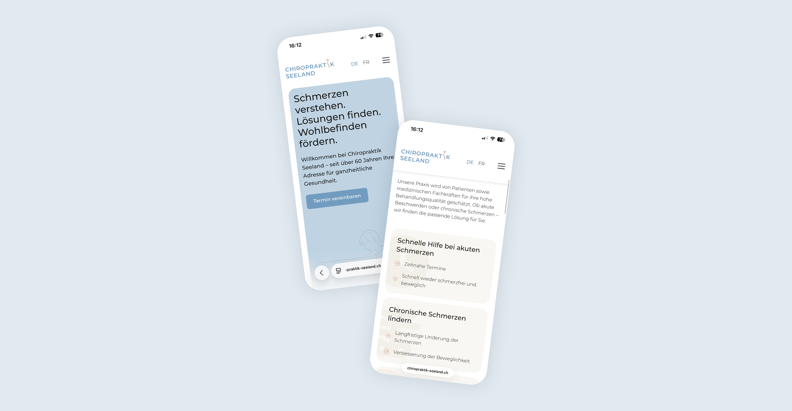
The new website was developed entirely in Webflow (SaaS) based on the Relume design system. It is technically modern, high-performance, and optimized for all screen sizes. Once development was complete, the practice team received training in Webflow Build mode and in creating SEO-optimized content.
This means that Chiropraktik Seeland now has all the tools and knowledge it needs to maintain the website independently, keep content up to date, and continue to expand its visibility in the long term.